Financial analysis with yfinance
In this example, we analyze Apple stock and implement a basic indicator to predict future movements.
Thanks to the yfinance package, we can download information about various financial markets. We select AAPL, which is the ticker for Apple, and specify the dates we want. Using rolling, we calculate the 9-day and 20-day moving averages.
import yfinance as yf
import numpy as np
import matplotlib.pyplot as plt

apple = yf.download('AAPL', start='2020-01-01', end='2021-01-01')

apple['9_MA'] = apple['Close'].rolling(window=9).mean()
apple['20_MA'] = apple['Close'].rolling(window=20).mean()
There are various financial indicators that analysts use to predict whether a stock will rise or fall in price. A widely used indicator is the moving average crossover. This indicator is interpreted as follows:
- 📈 If the fast average (
9days) crosses above the slow average (20days), it is common for the stock to rise ☝🏼 in the short term. - 📉 If the fast average (
9days) crosses below the slow average (20days), it is common for the stock to fall 👇🏼 in the short term.
This is precisely what we express in the following code. Using diff, we detect when one average crosses above or below the other.
apple['Signal'] = np.where(apple['9_MA'] > apple['20_MA'], 1.0, 0.0)
apple['Position'] = apple['Signal'].diff()
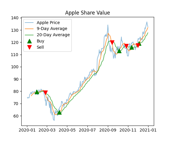
Now that we have all the data, we can plot it. The graph includes the Apple share price, the moving averages, and the buy and sell indicators we calculated.
plt.figure()
plt.plot(apple['Close'], label='Apple Price', alpha=0.5)
plt.plot(apple['9_MA'], label='9-Day Average', alpha=0.8)
plt.plot(apple['20_MA'], label='20-Day Average', alpha=0.8)

plt.plot(apple.index,
         np.where(apple['Position'] == 1, apple['9_MA'], np.nan),
         '^', markersize=10, color='g', lw=0, label='Buy')

plt.plot(apple.index,
         np.where(apple['Position'] == -1, apple['9_MA'], np.nan),
         'v', markersize=10, color='r', lw=0, label='Sell')

plt.title('Apple Share Value')
plt.legend(loc='best')
plt.show()
✏️ Exercises:
- Add a new graph that shows the daily return in percentage for Apple. This indicates how much the stock price increased or decreased each day.