Soccer analytics with seaborn
In this example, we will create a heatmap to visualize where the most passes were initiated during the Spain-England soccer match on July 14, 2024.
- ⚽ We will use
statsbombpyto obtain the match data. - 📉 We will use
seabornto graphically represent the information.
First, we obtain the data using the match_id of the match. We then filter the data to focus on the origin of the passes made by England throughout the match.
from statsbombpy import sb
import seaborn as sns
import matplotlib.pyplot as plt

ev = sb.events(match_id=3943043)
ev = ev.loc[
    (ev['type'] == "Pass") &
    (ev['team'] == "England")]
At this point, ev contains all the events related to England’s passes. The most important fields for this example are:
- 🎬
location: The starting point of each pass. - 🏁
pass_end_location: The point where each pass ended.
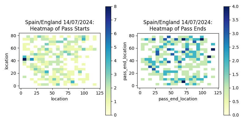
Next, we use seaborn to create a heatmap showing where the passes were initiated. This visualization helps identify hotspots from which passes were frequently started. It is evident that the goalkeeper initiated many passes.
plt.figure(figsize=(8, 4))

plt.subplot(1, 2, 1)
ax1 = sns.histplot(
    x=ev['location'].str[0],
    y=ev['location'].str[1],
    bins=(20, 20), cmap="YlGnBu", cbar=True)
ax1.set_aspect('equal', 'box')
plt.title('Spain/England 14/07/2024: Heatmap of Pass Starts')
We perform a similar analysis for the points where the passes ended. The str[0] and str[1] are used to extract the x and y coordinates on the field.
plt.subplot(1, 2, 2)
ax2 = sns.histplot(
    x=ev['pass_end_location'].str[0],
    y=ev['pass_end_location'].str[1],
    bins=(20, 20), cmap="YlGnBu", cbar=True)
ax2.set_aspect('equal', 'box')
plt.title('Spain/England 14/07/2024: Heatmap of Pass Ends')

plt.tight_layout()
plt.show()
✏️ Exercises:
- Create a similar representation for Spain and compare it with the heatmap for England.
- Create a plot using arrows to represent the passes.